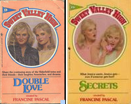
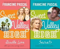
 Gawker had the goods yesterday on the relaunch of the Sweet Valley High series, complete with new covers featuring some soap star I’ve never heard of. I don’t hate the new covers. As much as I now feel a strange affection for the old ones (those pennants!) for purely nostalgic reasons, I remember hating that particular dorky drawing style of cover even as a kid.
And, yeah, I read all the SVH books I could get my hands on when I was a pre-teen, and I’m kind of sad that I don’t recall very much about them other than the bad girl/good girl, don’t-we-all-want-to-be-a-twin* thing. I read lots of pretty disposable tween/teen fiction, and about the only things that stick in my mind from that particular milieu are Christopher Pike books**. (I count Judy Blume and the Ramonas and stuff like that as things I read when I was younger, and not in the category of "pretty disposable tween/teen fiction" — The Baby-Sitters Club books would be another example and certainly of the series style stuff, though now that I’m thinking about this I remember adoring Betsy Haynes’ The Against Taffy Sinclair Club, which always seemed kind of an ode to meanness, and the later books in that spin-off series. Those books weren’t afraid to get their hands dirty. Anyway, before you judge, remember that I was also reading a lot of Shakespeare. It was a balanced fictional diet.)
Still, like Jenny Han over at the Longstockings, some of the text changes involved in the SVH repackaging trouble me. I could care less about the Fiat becoming a Jeep Wrangler, but as Han says:
So apparently a size 6 is no longer "perfect." The Wakefields are now a perfect size four, according to the press release. I’m surprised they didn’t go so far as saying, perfect size 2. Or zero for that matter! I mean, yes, clothing sizes are getting bigger (ie a 1950s size 8 is NOT a modern day size 8, it’s like a 4) as we are getting bigger, but it’s obvs not just that– today’s standard of beauty is basically anorexia. Just look at the runways! Look at Hollywood’s big stars! Nicole Kidman, Renee Zellweger, Sarah Michelle Gellar–all tiny.
Disgusting–why not obliterate references to the twins’ sizes at all, to *update* them? How far we’ve come, baby.
The often-hilarious SVH-focused Dairi Burger blog was created to "reread the entire series to relive my tween years, and also to get really angry at how SVH gave me a false and misguided view of high school life. And life in general. In fact, I blame all my insecurities, problems and worries on these books." She has even harsher words on the revamp, and wonders why the whole thing is necessary (or if it’s even possible):
Why? Trying to cash in? Will tweens of this generation appreciate it? I don’t think so. It’s so ridiculous and not like anything today. And think about how cellphone, internet and myspace would have affected the SVH kids. I don’t know if it would be better or worse. Plus, the Gossip Girl series is kind of the SVH of today.
Anyway, this is also a great excuse to link Lizzie Skurnick‘s awesome 2002 Baltimore City Paper piece "Girls Just Wanna Have Fun: Confessions of a Sweet Valley Scribe":
First of all, for those of you who think this piece serves as some nice free advertising for a certain hack, think again. There are no royalties in the world of Sweet Valley. There is also no author credit. That invariably goes to the ghostly Laurie John (who, according to some girls on Amazon.com, my lone source of public critical analysis, is "losing her touch") and to the creator, Francine Pascal (please don’t sue me), who lives it up in Paris off the skin of all of our typing fingers but is also the author of the completely awesome ’80s Y.A. masterpiece Hangin’ Out With Ceci, so I don’t care.
Writing for Sweet Valley does not, as many of my highfalutin academic colleagues seem to think, involve simply dumbing down "normal" writing or being shallow (although that serves as a good illustration of how we actually think of teenage girls). Teenagers are notoriously tough customers, and they can sniff out a snob or a suck-up very quickly: When I started using brand names in Jessica and Elizabeth’s bathroom, I was immediately admonished for commercialism on Amazon, and the reader reviews for my most recent book sent me quivering off with my tale between my legs ("This book should never have been written.").
Successful teen writing is about sound, as in sounding right. Neve Campbell changed the rhythm, and Buffy changed it a little more, but it all still depends on evoking that palpable sense of Sweet Valley, of biology class and beach parties in a camp-free environment, one as recognizable as Raymond Chandler’s L.A. but sometimes as elusive (again, case in point, "This book was OK but not good").
Reality bites, as they say (while we’re revisiting dated chesnuts). (Thanks to Micol for the heads up on the Gawker post.)
*Submitted as evidence: Brandon and Brenda. And there are rumors Rob Thomas may bring back some of the original cast members in his revamp, which frightens me. I think Brian Austin Green on The Sarah Connor Chronicles may be as much of that as I can handle.
**I’ve been considering rereading some of these for grins. I have a stack plucked from my childhood bookshelves on the corner of my desk Right Now.
Updated to add: Micol also sends along a timely and really sharp article on repackaging and YA from Print Magazine (about visual culture and design), which contains a decent basic overview of the genre’s history (at least in marketing and design terms) and an interesting discussion of trends in book design for teens. A snippet:
The hero or heroine of a typical YA novel is trying to make sense of the world and his or her own place within it, but the physical book is a clearly defined object unto itself. Indeed, it’s an accessory, explains Marc Aronson, author of Race and a longtime YA writer and editor. "It has to sit comfortably next to all the other objects in the reader’s world, their magazines and clothes and music. It’s all about a sense of coolness and intelligence. It’s a style—it’s saying, ‘We are exactly who you are. This is the world you’ll feel comfortable with. Nothing about this book is going to make you feel awkward to carry it and wear it. It’s as sleek and cool and as with-it as you are.’" That might explain YA author and feminist Paula Danziger’s seemingly incongruous bias against picturing the main character of The Cat Ate My Gymsuit, a girl struggling with her weight, on the original cover.
(Micol obviously had too much time on her hands yesterday).
Oh–and one more point to make before I put down the computer and rejoin the land of the living: just to bring it alllll back around. When I was at S&S we repackaged Francine Pascal’s three novels (that is to say, the three that she actually wrote, which were, in fact, AWESOME), under the “series” title: The Victoria Martin Trilogy. The cover model was the actress from Big Love and Mean Girls, the super-pretty blonde whose name I’m blanking on now. So.
I just wrote up my thoughts on the re-release of the books! Never a fan of the books, even in middle school, I am appalled at some of the changes made by Random House.
http://thereadingzone.wordpress.com/2008/03/28/sweet-valley-high-a-necessary-re-release/